| Updated 03.05.22
Website update
Very soon after I started to learn to code, my main goal was creating a website and getting it online. To me, that seemed like the only reason to want to learn how to code in the first place. To put my mark out there on the internet, to show off my new found skills.
I have recently realised how much of a creative outlet coding has become for me. Over the last year, we’ve all had a lot more time on our hands, so I’ve done a LOT of extra coding and learning. I have been much more introspective in learning about myself as well. One thing that has been extremely fascinating to me as of late, has been the personality traits of people and how they can affect your life. I may end up writing a post just on this topic eventually.
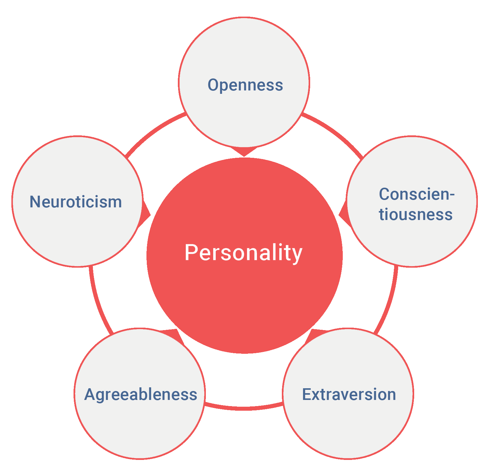
Essentially, I learned that one of the “big five” personality traits of people is known as “Openness”; this is the creative dimension of personality. People high in openness need an outlet for their creative ability, or they have difficulty thriving.
The reason I am even talking about this is that after doing research and completing a legitimate personality test (there is a tonne of pseudoscience out there to watch out for), I learned that my highest score was in openness. This immediately rang so true with me as I have always been so interested in creative endeavours. Well once I decided I wanted to re-do my entire site from scratch, I needed to add some blog functionality so I could have another creative outlet.
My First Website
My very first version of my website was just HTML, CSS and JS with no content management functionality. After getting into WordPress, I set it up as best I could so I could update my portfolio section and I was happy with that.
My intention in terms of design was, I wanted the look and feel to be as simple as possible and I envisioned it to look like an app or at least look very self-contained. Material Design by Google had not long been released and I instantly fell in love with it, they came up with a framework for design so that anyone could make something look really good with relative ease. So I tried to follow the guidelines they set out as best a non-designer could.
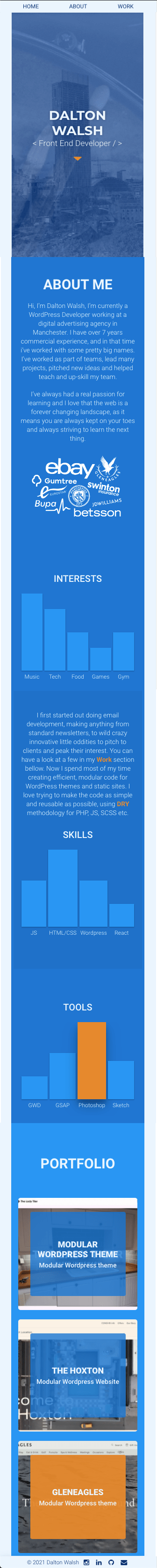
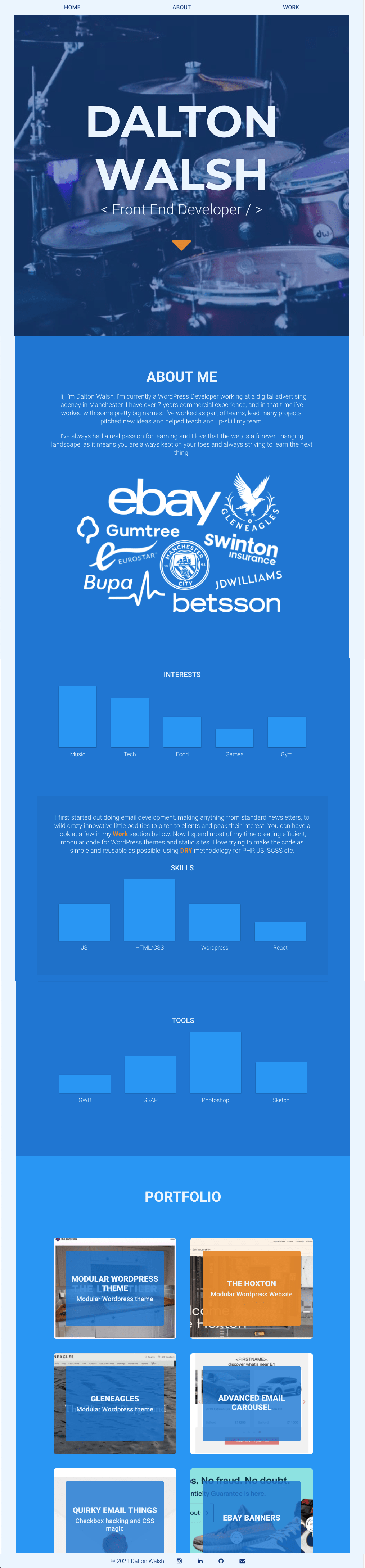
Below is what my site used to look like, hover over the devices to see more.
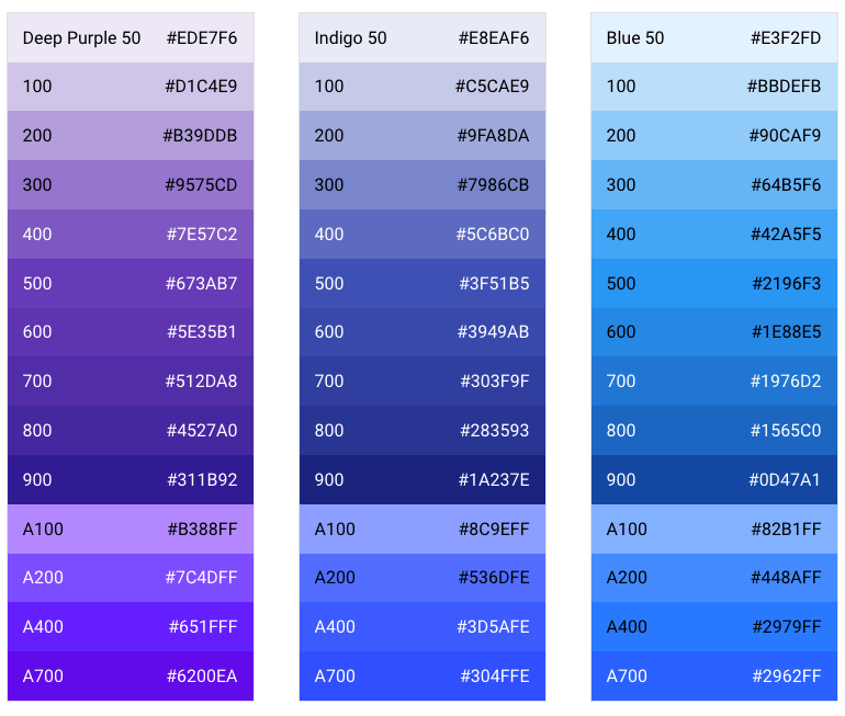
One cool feature I had was a very flexible colour scheme that could be updated super quick. I adopted the colour scheme’s from the Material design guidelines and I stored all the colours into separate SCSS variables so each colour variable was accessible throughout the codebase.
Below is how Google’s Material Design colours look in their documentation.
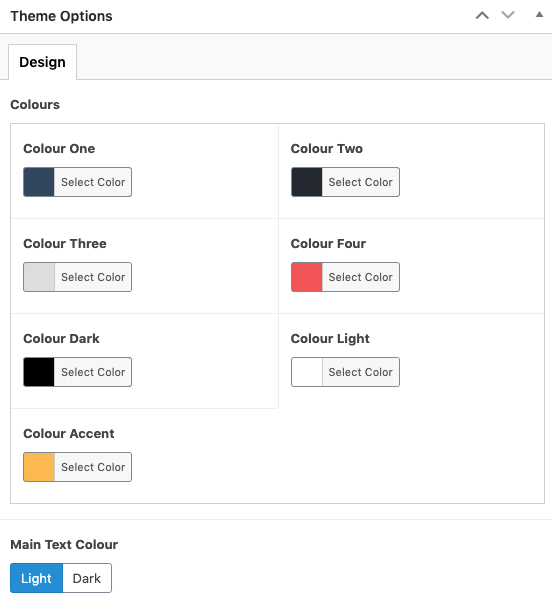
For my new WordPress theme, I have taken this a step further by enabling me to update the colours directly through the backend, rather than having to update it in code and push the update live like my old process. I have an options page set up with several variables that can be quickly updated such as colours or font-family.
Below is an example of what that looks like.
Again I took my learnings from working on big commercial projects like Gleneagles and The Hoxton and went with a very modular approach with my template. I love the fact that I can make a page with ease and re-use modules wherever I want.
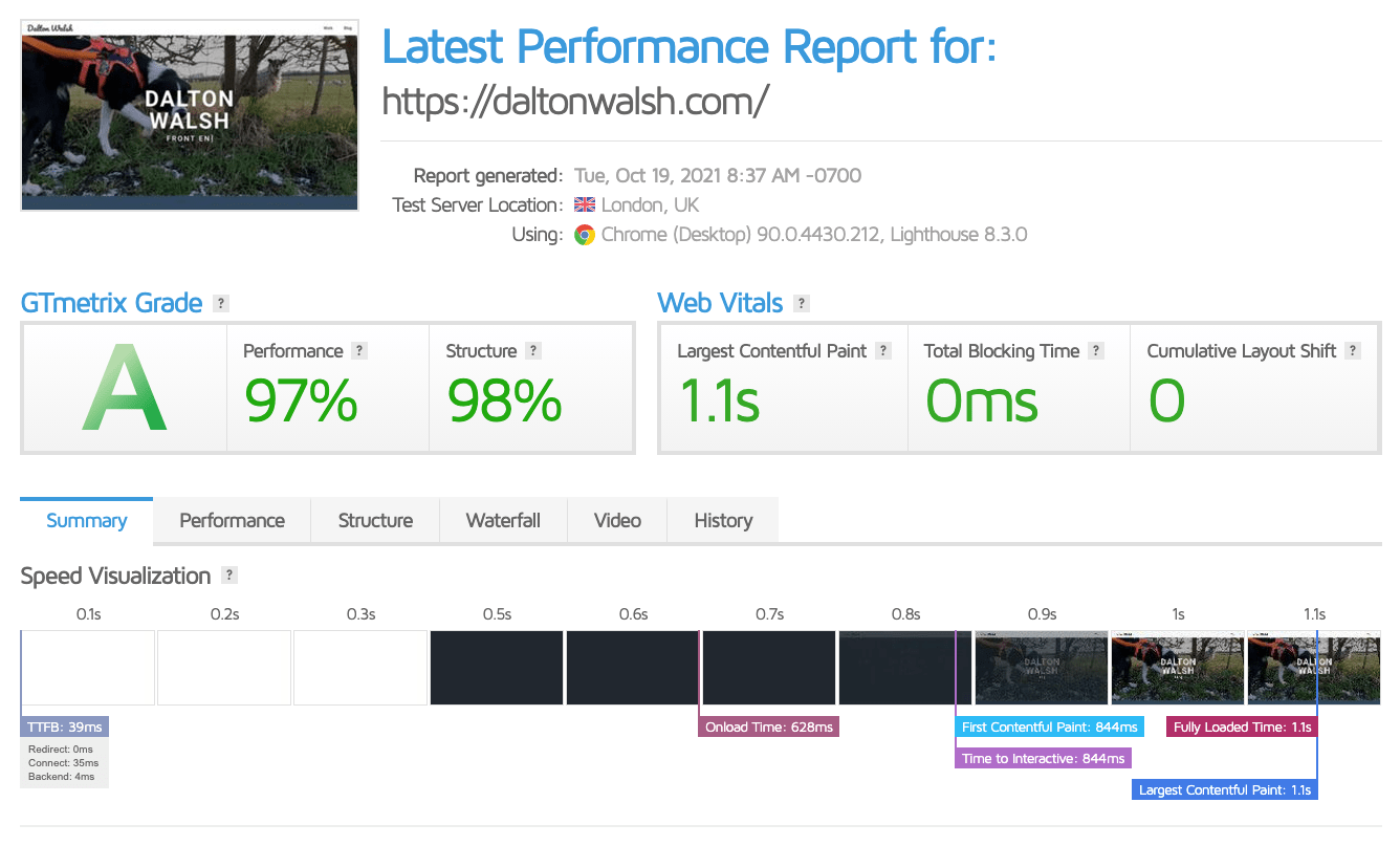
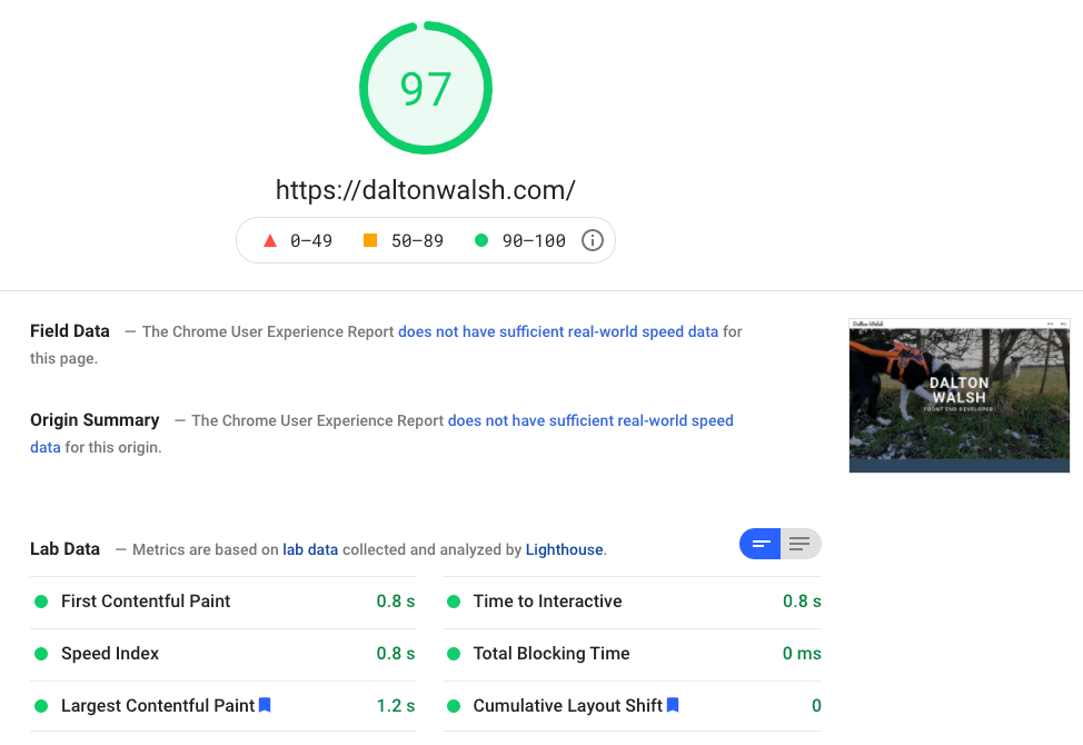
In addition to this, I’ve strived to make my site very accessible and focused on having a small page load by optimising my code and content as much as possible. I am very pleased with my results when running tests, take a look at them below.
I have a rather large Trello board of features I plan to add to my template but I thought I should finally release it into the wilds and update my site.