Tutorial
Aurora CSS Background Effect
| Updated 03.05.22
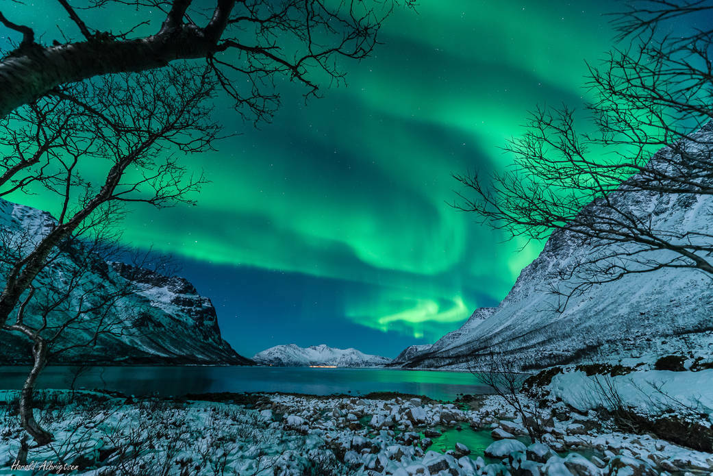
I’ve recently been seeing this cool looking background effect on various websites which made me really interested in trying to re-create it. I’ve heard it being called an “aurora” background effect because of the slowly changing gradient colours.
I liked it that much that I thought I would write up a quick tutorial on how you can create an Aurora CSS Background yourself, see it working in the Codepen below.
The HTML
Firstly, lets create some div’s that we will apply our CSS to.
<div class="colour-1"></div>
<div class="colour-2"></div>
<div class="colour-3"></div>
The CSS
Next up as you might have already guessed, we’re going to add all the styling to bring the Aurora effect to life.
So I just set a dark background colour on the body and add some position: absolute as well as reduced the opacity to the div tags that we will be moving around shortly. By making the divs slightly see-through, it will just add to the effect even more by letting the colours bleed through one and another.
body {
  background: #1c1ca2;
}

div {
  position: absolute;
  opacity: 0.75;
}
Now I hope you’re using SCSS because I’m about to use a feature that you may or may not have come across before, functions. Lately, I’ve been really trying to get the most out of SCSS and all the wonderful things you can achieve with it.
So I have created a very simple bit of code that will add some repeated styles, as well as insert the colour we need when we call the function.
@function shadow($color) {
  @return 0 0 45vmax 45vmax #{$color};
}
Next, we need to create some CSS animations. They are all pretty simple and shouldn’t need much explanation. The colour animations are used to move each of the different divs around the screen while the hueRotate changes the colours to create the effect.
@keyframes hueRotate {
  to {
    filter: hue-rotate(360deg);
  }
}

@keyframes colour-1 {
  0% {
    top: 0vh;
    left: 50vw;
  }
  25% {
    left: 0vw;
  }
  50% {
    top: 100vh;
  }
  75% {
    left: 100vw;
  }
  100% {
    top: 0vh;
    left: 50vw;
  }
}

@keyframes colour-2 {
  0% {
    top: 50vh;
    left: 100vw;
  }
  25% {
    top: 100vh;
  }
  50% {
    left: 0vw;
  }
  75% {
    top: 0vh;
  }
  100% {
    top: 50vh;
    left: 100vw;
  }
}

@keyframes colour-3 {
  0% {
    top: 100vh;
    left: 50vw;
  }
  25% {
    left: 100vw;
  }
  50% {
    top: 0vh;
  }
  75% {
    left: 0vw;
  }
  100% {
    top: 100vh;
    left: 50vw;
  }
}
Finally, we just need to apply the animations to each div and we’re done!
You can have a play around with the different timings on the hueRotate and the movement animations to get the desired effect. This set-up worked well enough for me.
.colour-1 {
  box-shadow: shadow(purple);
  animation: hueRotate 10s 0s linear infinite, colour-1 19s 0s linear infinite;
}

.colour-2 {
  box-shadow: shadow(blue);
  animation: hueRotate 15s 0s linear infinite, colour-2 25s 0s linear infinite;
}

.colour-3 {
  box-shadow: shadow(red);
  animation: hueRotate 20s 0s linear infinite, colour-3 15s 0s linear infinite;
}
If you enjoyed this post, be sure to check out some of my other CSS blog posts, such as Incrementing numbers in CSS, Centring in CSS, Useful CSS Generators.