Tutorial
Glassmorphism
| Updated 21.11.22
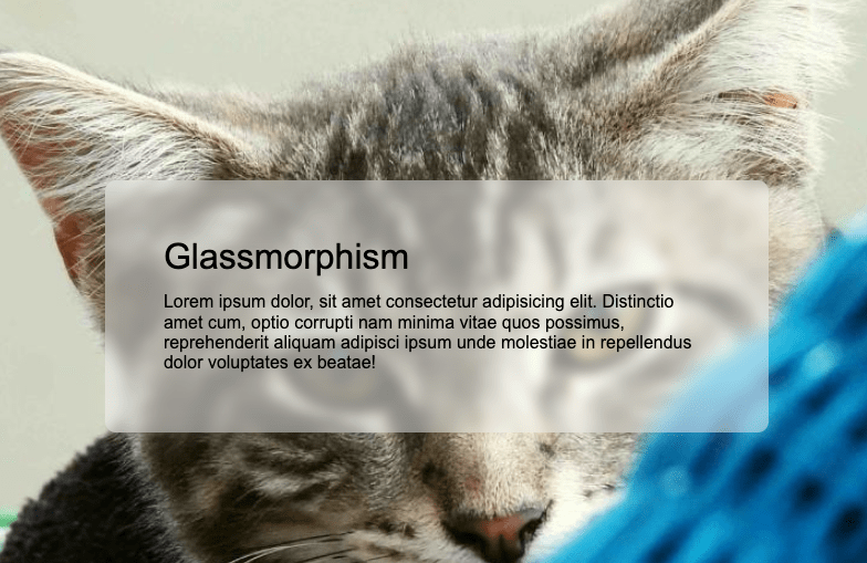
Glassmorphism is an emerging design trend that is currently gaining massive popularity. You will have probably seen it everywhere from websites like Dribbble, to big companies like Apple and Google.
Basically, the main characteristics of this trend are to create a semi-transparent backdrop, with a subtle shadow, and border. You generally also add a blur to the background itself so that the elements behind it are beautifully hidden, yet still visible.
See it working in the Codepen below.
See the Pen
Glassmorphism by Dalton Walsh (@daltonw)
on CodePen.
Tutorial
This will be short and sweet 🎂!
HTML
This effect is all in the CSS, so simply set up some content that you want to make have this glassy effect and give it a class so you can then target your element with some styling.
<div class="text-box">
    <h1>Glassmorphism</h1>
    <p>Lorem ipsum dolor, sit amet consectetur adipisicing elit. Distinctio amet cum, optio corrupti nam minima vitae quos possimus, reprehenderit aliquam adipisci ipsum unde molestiae in repellendus dolor voluptates ex beatae!</p>
</div>
CSS
So as I’ve previously said, this effect is all in the CSS. It is very simple CSS as well, so even better!
What we are accomplishing here is merely setting a background colour that has a slight opacity to it. Then we set a filter to the backdrop that adds a blur effect of 5px. Finally, we add a drop shadow to round out the effect.
.text-box {
  background: rgba(255, 255, 255, 0.4);
  backdrop-filter: blur(5px);
  filter: drop-shadow(0px 1px 10px #00000080);
}
If you appreciated this post, be sure to check out some of my other CSS blog posts, such as Incrementing numbers in CSS, Centring in CSS, Useful CSS Generators.
